Listening to others: a personal view by Andrew
Teller, ENS society manager
Creative Cost Comparisons
The use of the word “creative” in
the title of this article is inspired from the well-established
phrase “creative accounting”. According to Wikipedia,
an Internet encyclopædia, creative accounting refers to
accounting practices that deviate from the standard ones. In particular,
it can be used to refer to systematic misrepresentation of the
true income and assets of business organisations.
As we shall see shortly, creativity in this sense is not restricted
to accounting. My attention was recently drawn to a graph published
in January 2004 by the American magazine Windpower Monthly1.
The said graph purported to plot the price of wind power against
coal, gas and nuclear. Its objective was to show that wind energy
is becoming competitive with the cheapest non-renewable energy
sources. One would think that this is a tall order. Not if you
have sufficient imagination. The way in which the task was tackled
makes it worth while analysing. Since I do not wish to infringe
any copyrights, I shall proceed in three steps using my own graphs.
First, one must prepare a bar chart showing the price ranges in
$/MWh for the three non-renewable energy sources. Energy sources
1, 2 and 3 are supposed to stand for gas, coal and nuclear respectively.
Here already, one might question the figures chosen: no source
is given for the price ranges considered. They might apply to
the US context, but are certainly not valid for EU countries,
as testified by numerous studies and the recent Finnish decision
to build Finland 5. I shall not spend more time on this issue
in order not to deviate from the point I am trying to make. Let
us just note that gas would come out cheapest and nuclear most
expensive, both as regards the bottom and top ends of the ranges,
as shown in fig 1.
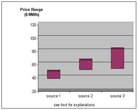
figure 1
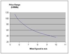
One then proceeds to plot the cost of energy produced vs. the
wind speed. It can be easily shown that the energy converted into
electricity E is proportional to the third power of the wind speed.
If we consider that the only generation cost involved is the investment
needed to build the wind machine, then the cost per MWh produced
c is equal to this investment divided by E. This entails that
cost c is inversely proportional to the third power of
the wind speed. Such relationship explains why cost c decreases
rapidly when the wind speed increases, as shown in fig 2.

figure 2
Now comes the last and most interesting part
of the exercise. Since the unit cost of wind electricity also
varies in the present case, one just has to call it price range.
One is then able to take advantage of the commonality of the variable
plotted along the vertical axis to combine the two graphs into
a single picture.
Before doing so however, the truly creative person will however
tilt the bar chart at a suitable angle so as to enhance the impression
of escalating costs with the non-renewable energy sources. The
final result is shown in figure 3.
figure 3
Putting the two graphs side by side then enables
one to claim that with an average wind speed above 8 m/s, wind
electricity competes cost-wise with the best gas plants.
It might be true that the best wind farms deliver
electricity that is less costly than the electricity produced
by the best gas plants. Decisions however are not made on the
basis of the exceptional, but on the basis of the likely. And
the least one can say is that the likely is not to be found in
figure 3.
On the non-renewable side, price ranges have been displayed to
translate the impact of the variation of a large number of parameters
(erection and maintenance costs, fuel price, discount rate, etc.)
on the cost of electricity.
What has been done on the wind side is quite different: one has
plotted the consequences in money terms of the physical law linking
the energy produced to the wind speed. Had one treated wind in
the same way as the non-renewables, one would have obtained something
similar to figure 4. The cheapest wind electricity would still
beat the best performing plants using non-renewable energy sources
(assuming the figures used are reliable), but the true message
depicts a much more complex reality than in figure 3.
figure 4
Overlooking the fact that the optimal wind conditions
are actually in short supply, both time-wise and space-wise further
skews the comparison.
The worst in my view however is that the “clever”
layout adopted for figure 3 will lead the non-specialists to associate
non-renewables with high costs and wind energy with low costs.
Things are far from being that simple: if wind energy was so cheap,
why not go for 100% wind electricity? In a similar vein, just
swap the positions of sources 1 and 3 in figure 3: what is left
from the “demonstration”?
It is a pity that the wind industry tolerates such pieces of
inaccurate reasoning in its reports. Due to its intermittent nature,
wind energy absolutely needs to be backed up by steady energy
sources. Among them, nuclear is the only one that, like wind,
does not generate carbon dioxide. The case of wind energy only
confirms the validity of the energy mix concept and the need to
include nuclear in the said mix.
Let us nevertheless conclude on a more positive note. Next time
your neighbour tells you it’s now been established that
wind power is competitive with the best non-renewable power plants,
you’ll know why (s)he might be absolutely sincere.
1
A copy of the graph can be found on the Internet on page 73 of
“Wind Force 12” (http://www.ewea.org/documents/WF12-2004_eng.pdf),
a report published in May 2004 by the European Wind Energy Association
(EWEA). To be complete, it must be added that the cover page of
the document also bears the Greenpeace logo. |